Quiet Memory
A softer direction using landscape, portrait layering, and a restrained palette.
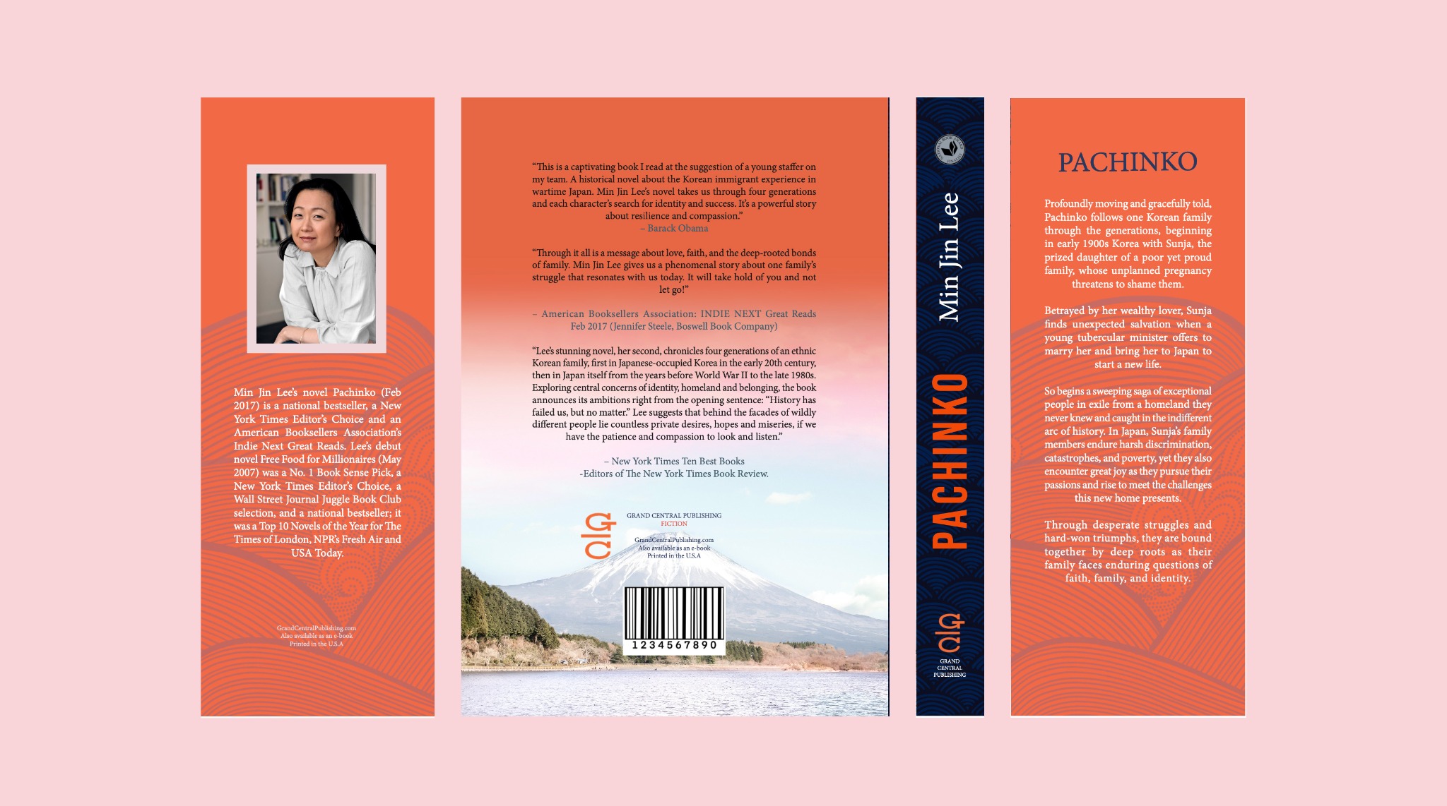
A visual reinterpretation of identity, migration, and generational resilience through a redesigned cover system.
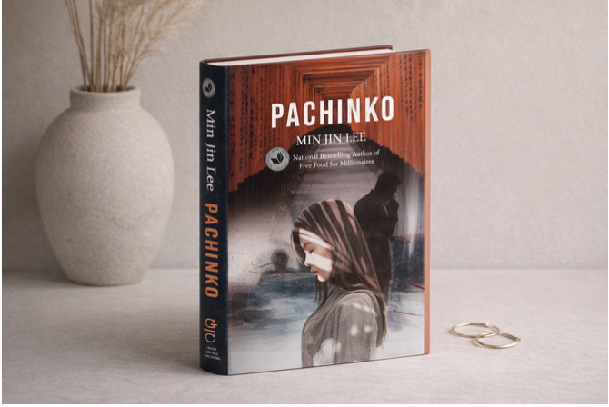
The redesign explores how a literary cover can communicate emotional weight before the reader opens the book. The goal was to move beyond decorative symbolism and create a cover that feels dramatic, intimate, and culturally rooted.
Deliverables: front cover, back cover, spine/sleeve direction, and product mockup.


The redesign needed stronger emotional tension, clearer visual hierarchy, and a more memorable shelf presence.

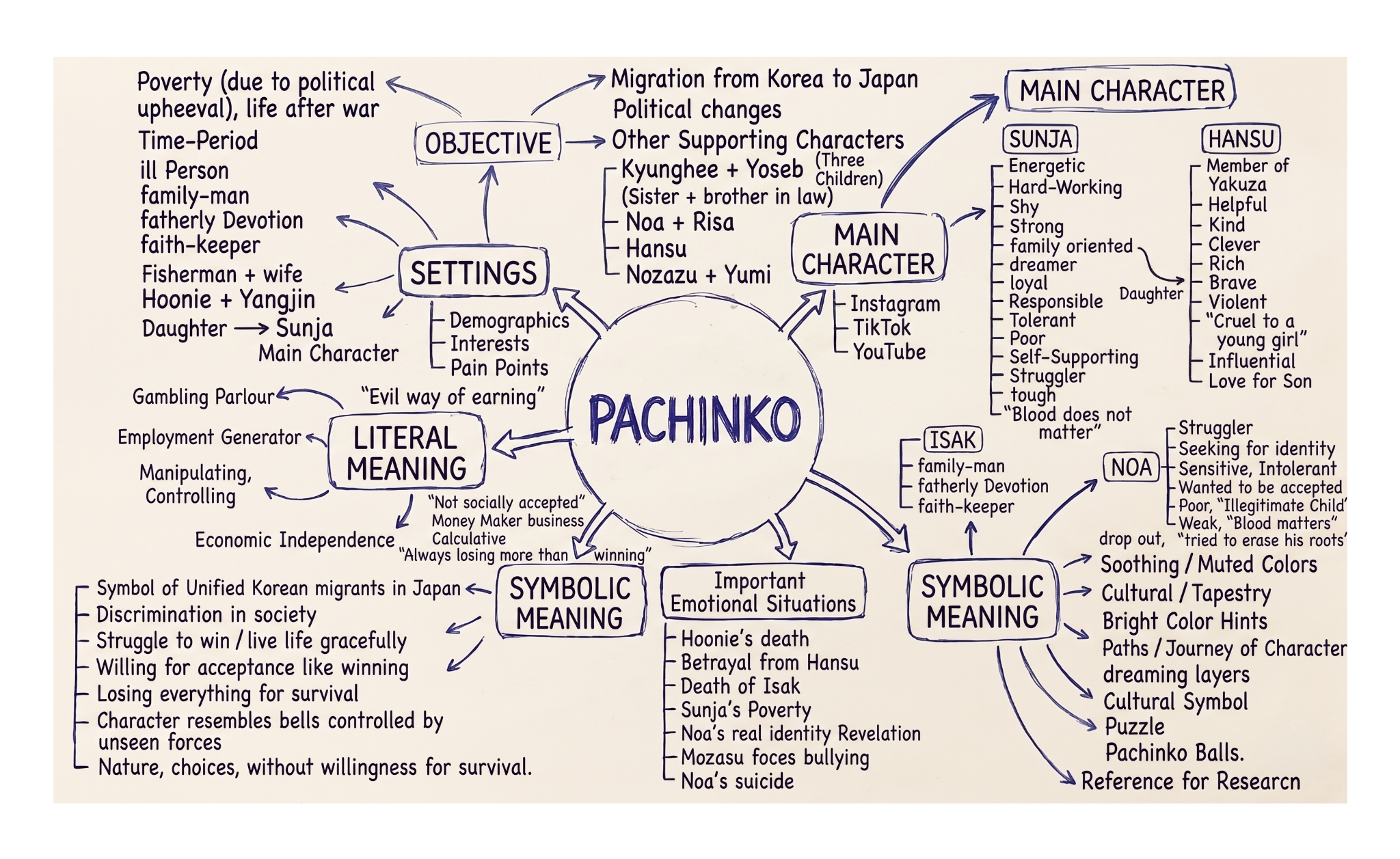
The mind map helped separate story details from usable design cues: migration, identity, family burden, discrimination, poverty, and the symbolic meaning of pachinko as chance and survival.
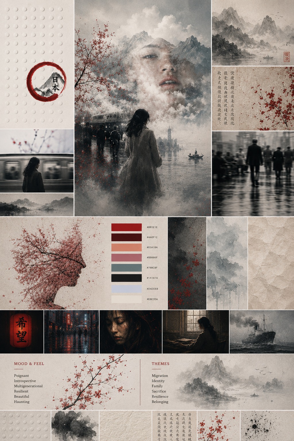
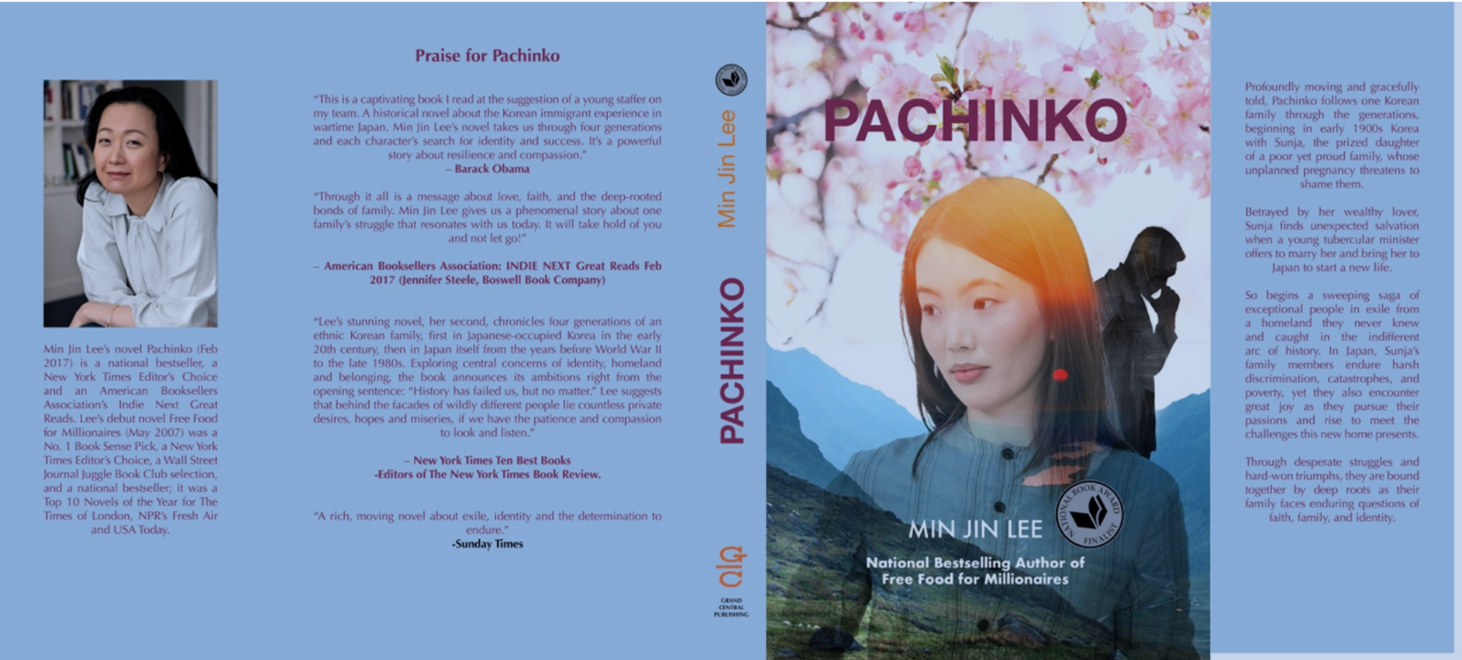
A softer direction using landscape, portrait layering, and a restrained palette.
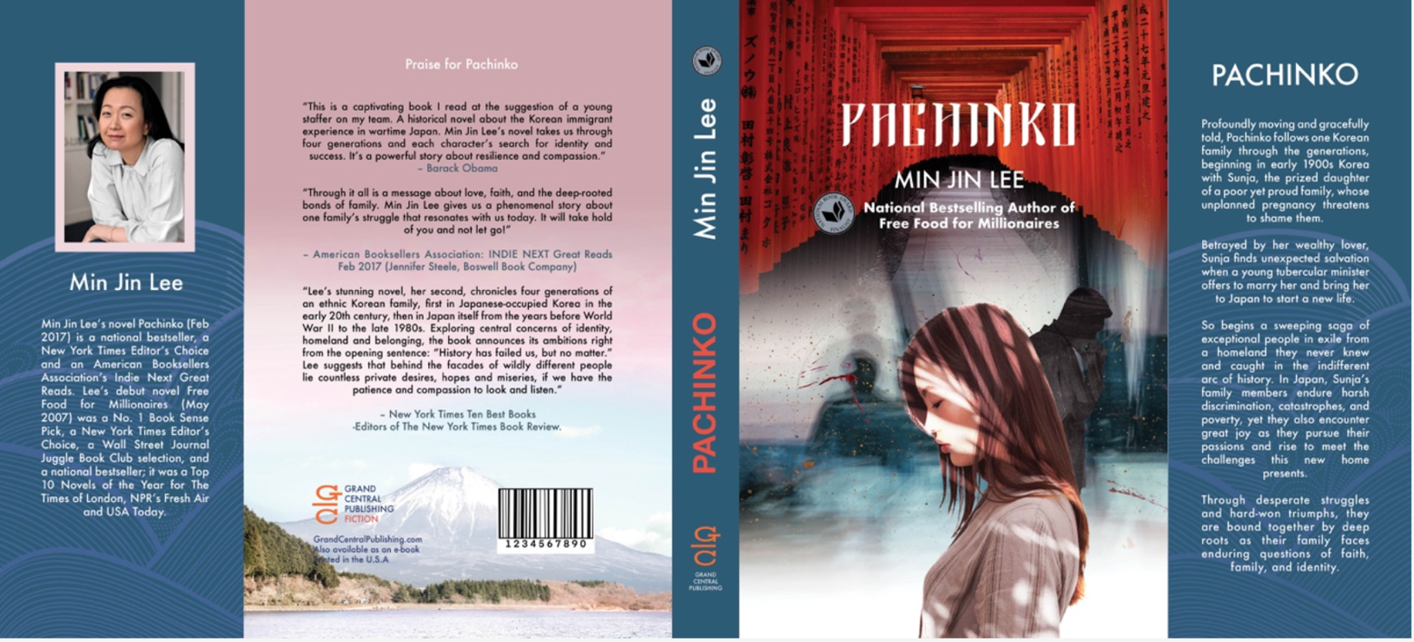
A full jacket direction built around red gates, contrast, and movement.
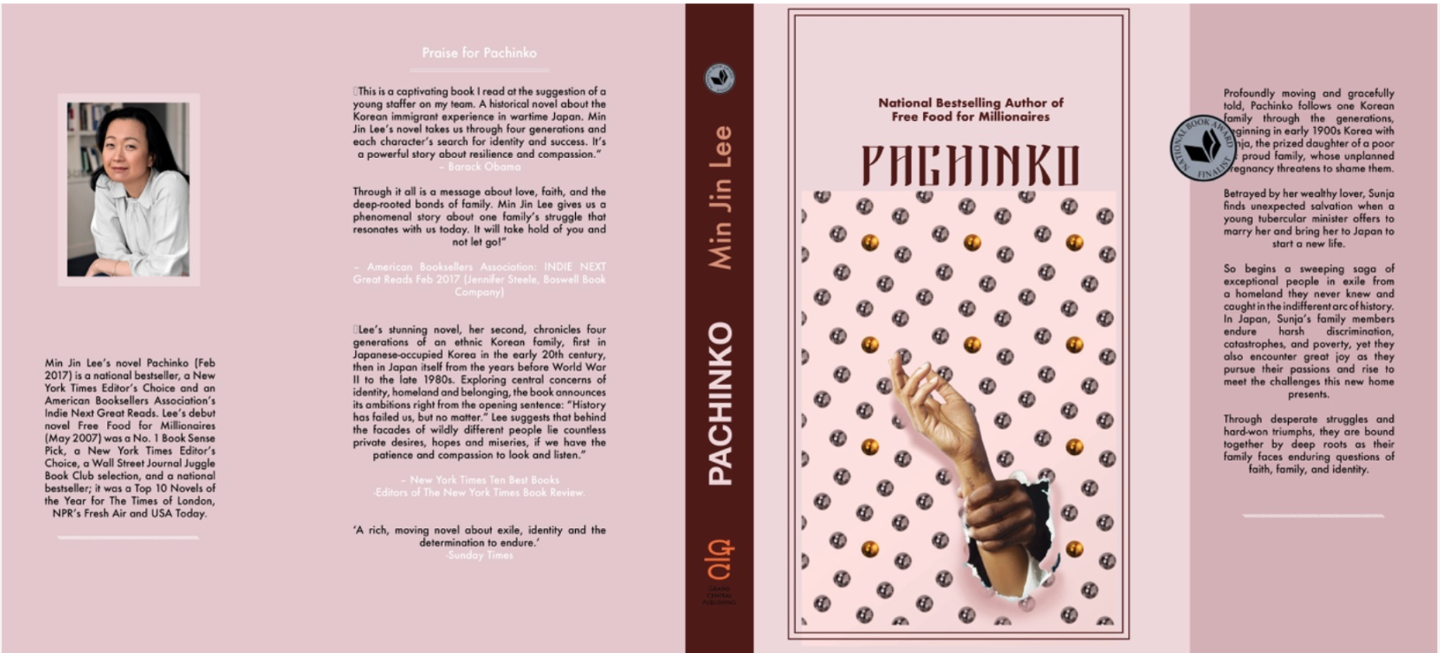
A more graphic concept using pachinko-ball repetition as a metaphor for fate.